
Project Brief
timeline
4 weeks
ROLE
UI/UX designer, Visual designer
TEAM
1 Designer + 4 Developers
tools
Figma, Adobe Illustrator
Overview
HackAI is AIS's flagship 24-hour hackathon bringing together 250+ students, sponsors, and tech leaders. Despite the event's scale, the previous website felt generic and failed to communicate why students should participate.
Through user research with 10 students and firsthand immersion at WeHack 2023, I identified three critical needs: immediate clarity, seamless sign-up, and trust-building design. The solution? A bold casino-themed redesign that drove a 262% increase in participation and established a visual foundation for future events.
Impact at a Glance
262%
Increase in event participation from previous year
4.8/5
Navigation satisfaction score from users
<10 sec
100% of test users found key info in under 10 seconds
User research
Understanding the User: Research & Discovery
the problem
HackAI Needed to Look as Ambitious as Its Vision
HackAI is AIS's flagship event—a 24-hour AI-themed hackathon that brings together students, sponsors, and industry leaders. Despite the scale and prestige of the event, the previous website didn't reflect this.
❌
Generic & Minimal
The old site felt like a small, unestablished event. No visual identity, no energy, no personality.
❌
Unclear Value
Students couldn't answer "Why should I join?" Information was buried, logistics unclear.
❌
Low Credibility
Design didn't communicate the event's scale, sponsors, or prestige. Felt amateur compared to other hackathons.
❌
No Excitement
Nothing about the site built anticipation or reflected the intense, competitive hackathon experience.
the challenge
Create a website that builds credibility, excitement, and trust instantly
How might we transform HackAI's online presence to match the ambition of the event itself—building credibility, excitement, and trust while making information instantly accessible?
USER RESEARCH
Real Voices, Real Frustrations
User interviews with 10 students (first-timers and veterans) revealed what makes or breaks a hackathon website experience.
1
Immediate Clarity
Users wanted to feel the theme and find answers fast. No hunting for basic info.
2
Seamless Sign-Up
Friction at registration led to drop-off. Every extra click was a potential lost participant.
3
Trust-Building Design
First impressions had to deliver excitement + ease. Students judge events by their websites.
What Students Told Us
"First impressions matter—users want to feel the theme and energy immediately."
Frictionless registration increases the chance they'll sign up.
"Users need answers to logistical questions (FAQ, eligibility, location)."
"The website should reflect the experience and build anticipation."
"Event info should be instantly accessible."
user persona
The first-time hacker: Needs encouragement, clarity, and onboarding
The seasoned coder: Wants speed, structure, and answers
Their needs shaped our homepage, navigation, and tone.


user immersion
Empathy in Action: I Became the User
To understand the hackathon experience from the inside, I joined WeHack 2023—my first hackathon. Immersing myself in the event let me spot friction points and emotional highs that I brought back to HackAI.
Our team's design even won 1st place—proof that understanding the user experience deeply leads to better design outcomes.
define
From Research to Design Principles
The user research revealed clear patterns. Students needed more than just information—they needed an experience that felt trustworthy, exciting, and effortless from the first click. These insights became the foundation for every design decision.
2
Create Anticipation
The website should feel as exciting as the event itself. Theme and energy need to come through before users even scroll.
3
Remove All Friction
Every unnecessary click is a lost participant. Information must be instantly accessible, and registration seamless.
How Might We...
→ Design a visual identity that immediately communicates the scale and prestige of HackAI?
→ Make event details (schedule, tracks, FAQs) instantly accessible without overwhelming users?
→ Create a registration flow so frictionless that students sign up on impulse?
→ Build anticipation and excitement that matches the actual hackathon experience?
COMPETITIVE ANALYSIS
What Great Hackathons Get Right (and Wrong)
I reviewed 9 top hackathon sites, rating them on four UX factors: design, navigation, event clarity, and accessibility. This analysis revealed patterns in what works—and what frustrates users.

IDEATION & WIREFRAMING
User Journey & Wireframes
Close-up Storyboard:
Emily, the First-Time Hacker, Signing Up for HackAI

Sketching the Vision
Our process started with low-fidelity wireframes focused on the registration flow, schedule access, and mobile-first layout. The key decision: a single-page structure to minimize navigation friction.


Strategic Wireframe Decisions
📱
Single-Page Layout
Eliminated navigation friction by putting everything on one scrollable page—matching user expectations for event sites.
🎴
Card-Based Tracks
Designed tracks as poker cards (matching casino theme) for instant scannability and visual interest.
Final Design
Bringing the Vision to Life
From wireframes to high-fidelity design, every decision was guided by our research insights: build trust instantly, create anticipation, and remove all friction. The result is a website that feels as ambitious and exciting as HackAI itself.
hero section
From Narrow Concepts to Expansive Vision
The hero section went through multiple iterations before landing on the final design. The evolution shows how we moved from gimmicky single interactions to an immersive casino experience.
Variation 1: Slot Machine
Too focused on single element
Variation 2: Claw Machine
Still too focused on single element
Final: Casino Experience ✓
Creates a complete world
Design Decisions
Why the Final Design Won
The first two concepts focused on a single interactive element—a slot machine and a claw machine. While playful, they felt too narrow and gimmicky, limiting the theme to one interaction.
The final design opened up the entire Vegas casino experience—neon signs, city skyline, multiple visual elements. This created a sense of scale, ambition, and possibility. By embracing the full casino environment, we built a world students could imagine themselves in, not just a single game to play. This approach directly addresses the research finding: "First impressions matter—users want to feel the theme and energy immediately."
Tracks Section
Interactive Card-Based Tracks
Instead of overwhelming users with dense track descriptions, we transformed the information into an interactive card game—literally. Each track is represented as a playing card that reveals details on hover.
The Card Metaphor in Action
Front of card: Track name + suit symbol (♠ ♥ ♦ ♣) for instant recognition
Hover to flip: Reveals track details, description, and focus areas
Design Decisions
Why This Works
→ Familiar mental model: Everyone understands "flip to reveal"—no learning curve required
→ Progressive disclosure: Information is organized and digestible. Emily (first-timer) isn't overwhelmed; Jayden (veteran) can scan quickly and flip only what he needs
→ Thematic consistency: Playing cards reinforce the casino theme while serving a functional purpose
→ Interactive delight: The hover interaction adds engagement and makes tracks memorable
schedule Section
Smart Schedule Design: Desktop & Mobile
The schedule is where users spend the most time during an event—constantly checking times, locations, and what's next. We designed for both pre-event planning (desktop) and day-of reference (mobile).

Key Features:
Auto-displays the current/relevant day without requiring clicks
Clear time markers and event categories for quick scanning
Export to calendar functionality for easy planning

Mobile Experience
Single-column, thumb-friendly layout
Visual hierarchy: Major events in bold, meals in lighter weight
Design Decisions
Why This Works
→ Frictionless access: Research showed "frictionless registration increases signup." By auto-displaying the correct day and eliminating unnecessary clicks, we remove decision fatigue. Students see exactly what to expect without hunting.
→ Serves both personas: Emily (first-timer) gets the detailed timeline she needs to feel prepared. Jayden (veteran) can quickly scan times without reading paragraphs.
→ Mobile-first thinking: Students check schedules constantly during events—on their phones, not laptops. The mobile design prioritizes this behavior with quick-load times and one-thumb navigation.
results
The Site that Drives Real Engagement
The redesign didn't just look better—it performed better. From participation numbers to user satisfaction, every metric showed that the new design successfully solved the problems we identified in research.
< 10 sec
100% of test users found key info in under 10 seconds
4.8/5
Navigation satisfaction score from users
250+ participants
That's a 262% increase from the previous year
Design system
The redesign established a visual and functional foundation for future events
Real-World Impact
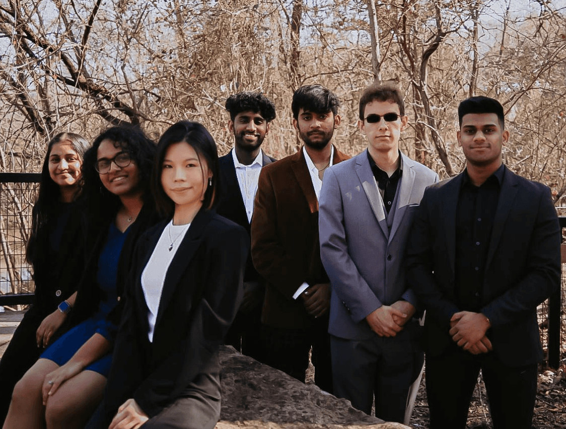
Big shoutout to the amazing team behind HackAI—couldn't have done it without you!

The Tech Team
By the Numbers

reflection
Reflections & Learnings
Challenges I Navigated
Tight Timeline
"We need the site live in 4 weeks for registration to open."
Solution: Focused on high-impact features first (hero, tracks, schedule, registration) and deprioritized nice-to-haves. Created a lightweight design system for faster handoff to developers.
Serving Two User Types
First-timers need encouragement; veterans need speed and efficiency.
Solution: Designed for progressive disclosure—surface-level info is instantly accessible (for Jayden), while detailed explanations are one click away (for Emily). Both personas get what they need without friction.
Bold Theme vs. Accessibility
Dark casino aesthetic could compromise readability and contrast.
Solution: Used high-contrast white text on dark backgrounds, tested color combinations for WCAG AA compliance, and ensured all interactive elements had clear focus states for keyboard navigation.
📚
What I Learned
This project pushed me to balance bold creative vision with real-world constraints—tight timelines, technical limitations, and diverse user needs. Here's what shaped my growth as a designer.
→
Collaborate with devs and organizers under real deadlines
→
Translate high-level goals into focused, user-first design
→
Balance theme, accessibility, and action
→
Next Steps
While the 2023 redesign successfully achieved its goals, there's room to evolve. Future improvements include adding dark/light mode toggle, refining mobile views across all sections, and building a modular design system that can scale across AIS's growing event portfolio.