AIS Website Redesign

AIS Website Redesign

AIS Website Redesign

Turning Visitors into Engaged Members through Strategic UX

Turning Visitors into Engaged Members through Strategic UX

Turning Visitors into Engaged Members through Strategic UX

Project Brief

timeline

6 weeks

ROLE

UI/UX Designer, Design Lead

TEAM

1 Designer + 3 Developers

tools

Figma, Canva, Adobe Illustrator, Relume AI

Overview

The Artificial Intelligence Society (AIS), a non-profit student organization at UTD, had a cluttered website that failed to convert visitors into members. Through competitive analysis and user testing, I redesigned the site with clear visual identity and intuitive hierarchy.

Impact at a Glance

40%

CTR increase (from <20% to 40%) on key actions

40%

CTR increase (from <20% to 40%) on key actions

40%

CTR increase (from <20% to 40%) on key actions

2x

Page impressions doubled after redesign launch

2x

Page impressions doubled after redesign launch

2x

Page impressions doubled after redesign launch

Increased event participation and membership applications

Higher turnout

Increased event participation and membership applications

Higher turnout

Increased event participation and membership applications

Higher turnout

THE CHALLENGE

How might we transform AIS's online presence to convert curious visitors into active members?

Despite being one of UTD's most active student organizations, the AIS website overwhelmed users and buried key information. We needed to establish a strong visual identity, create clear hierarchy, and make the path to membership frictionless.

User Research

User Research

User Research

Understanding the Problem

We conducted mixed-methods research to understand why the current website wasn't converting interest into engagement and membership.

⚙️ Project Constraints

Working with existing tech stack while coordinating a full rebranding with a new tech team. Required close collaboration to align design vision with technical capabilities and evolving brand guidelines (new logo and colors only—typography and additional brand elements needed to be established).

Research Methods

  • User interviews (n=20: 18 students, 2 stakeholders)

  • User personas

  • User journey mapping

  • Competitive analysis

What Users Told Us

New Users

I want to know what this organization actually does before I commit to anything.

Returning Users

I just need to quickly check if that workshop is still happening this week.

Research Synthesis

Research Synthesis

Research Synthesis

Key Insights

1

Users Can't Find What They Need

70% found navigation only "somewhat easy" to use. Students struggled finding event sign-ups, stakeholders couldn't locate contact info, and poor visual hierarchy made clickable elements unclear. Non-functional interactive elements frustrated users who expected them to work.

2

Content is Outdated & Hard to Scan

75% complained about outdated event information. The text-heavy design with disorganized event cards created cognitive overload. Users had to work harder to process information, making it difficult to quickly find workshop details or understand what AIS offers.

3

Design Lacks Energy & Clarity

Only 50% found design "somewhat appealing." Inadequate CTAs reduced conversion potential, making key actions less discoverable. Generic visuals failed to reflect AIS's vibrant community or excite prospective members about joining.

User Persona

User Persona

User Persona

Meet Sarah

Based on our research insights and user interviews, we created Sarah to represent our core user: motivated students who crave AI opportunities but feel overwhelmed by the current website.

User Journey Map

User Journey Map

User Journey Map

Sarah's Journey

I created a To-Be user journey map of Sarah's experience finding and attending an AIS event to identify pain points and uncover opportunities for a smoother, more engaging user flow.

Competitive Analysis

Competitive Analysis

Competitive Analysis

Looking Outward

We benchmarked high-performing student org sites and saw consistent patterns that successful clubs implement to engage and convert visitors.

🧭

Simple Navigation

Clear menu structure with intuitive labels that help users find what they need quickly

🧭

Simple Navigation

Clear menu structure with intuitive labels that help users find what they need quickly

🧭

Simple Navigation

Clear menu structure with intuitive labels that help users find what they need quickly

📅

Clear Event Info

Prominent event listings with time, location, and RSVP links easily accessible

📅

Clear Event Info

Prominent event listings with time, location, and RSVP links easily accessible

📅

Clear Event Info

Prominent event listings with time, location, and RSVP links easily accessible

Strong Brand Identity

Cohesive visual design that reflects the organization's energy and values

Strong Brand Identity

Cohesive visual design that reflects the organization's energy and values

Strong Brand Identity

Cohesive visual design that reflects the organization's energy and values

🎯

Obvious CTA

Prominent buttons and CTAs that guide users toward joining, attending, or learning more

🎯

Obvious CTA

Prominent buttons and CTAs that guide users toward joining, attending, or learning more

🎯

Obvious CTA

Prominent buttons and CTAs that guide users toward joining, attending, or learning more

Key Opportunity

Bridge the Gap Between Discovery and Action

Current AIS site lacks all four critical patterns—simple navigation, clear event info, strong brand identity, and obvious CTAs—creating friction at every step of the user journey. Our redesign must address each of these gaps to transform visitor interest into active membership.

DEFINE

DEFINE

DEFINE

From Insights to Action

Based on our research, we reframed student pain points into actionable design questions that would guide our redesign strategy.

Confusion about the org's mission

Missed events

Navigation overwhelm

Unclear onboarding

Bland visuals

...explain AIS in 5 seconds?

...surface upcoming events clearly?

...get users to key info in 1-2 clicks?

...make joining feel easy and inviting?

...design a site that feels uniquely AIS?

Design Challenge

Design Challenge

Design Challenge

How might we transform the AIS website from an information repository into an engaging hub that inspires students to join and participate?

The current site overwhelms users with dense content, unclear navigation, and generic visuals that don't reflect AIS's energy. Our redesign must establish a strong brand identity, optimize information architecture, and build trust before asking for commitment.

Our Solution Approach

1

Establish Visual Brand Identity

Create bold, AI-themed design language that reflects AIS's vibrant energy and makes the organization feel approachable and exciting.

1

Establish Visual Brand Identity

Create bold, AI-themed design language that reflects AIS's vibrant energy and makes the organization feel approachable and exciting.

1

Establish Visual Brand Identity

Create bold, AI-themed design language that reflects AIS's vibrant energy and makes the organization feel approachable and exciting.

2

Optimize Event Discovery

Feature prominent event hierarchy with categorization and filtering to reduce overwhelm while maintaining high visibility.

2

Optimize Event Discovery

Feature prominent event hierarchy with categorization and filtering to reduce overwhelm while maintaining high visibility.

2

Optimize Event Discovery

Feature prominent event hierarchy with categorization and filtering to reduce overwhelm while maintaining high visibility.

3

Build Trust Before Asking

Lead with value proposition and social proof before presenting membership applications—converting interest into commitment.

3

Build Trust Before Asking

Lead with value proposition and social proof before presenting membership applications—converting interest into commitment.

3

Build Trust Before Asking

Lead with value proposition and social proof before presenting membership applications—converting interest into commitment.

Ideate

Ideate

Ideate

Ideation & Wireframing

I explored multiple layout approaches for key pages, leveraging Relume AI to generate initial wireframes and iterating to match our design goals.

Note: Final designs evolved from these wireframes based on technical constraints, team feedback, and the evolving brand guidelines.

Key Pages Explored

Event Page

Featured event hierarchy with one hero card grabs attention, while category filters and upcoming/ archived separation help users quickly find relevant content without cognitive overload.

Event Page

Featured event hierarchy with one hero card grabs attention, while category filters and upcoming/ archived separation help users quickly find relevant content without cognitive overload.

Event Page

Featured event hierarchy with one hero card grabs attention, while category filters and upcoming/ archived separation help users quickly find relevant content without cognitive overload.

Join Us Page

Value proposition and benefits showcased first, THEN application paths—plus testimonials build trust. This strategic flow converts interest into action.

Join Us Page

Value proposition and benefits showcased first, THEN application paths—plus testimonials build trust. This strategic flow converts interest into action.

Join Us Page

Value proposition and benefits showcased first, THEN application paths—plus testimonials build trust. This strategic flow converts interest into action.

Home Page

Hero with mission statement, featured events preview, and prominent join CTAs

Home Page

Hero with mission statement, featured events preview, and prominent join CTAs

Home Page

Hero with mission statement, featured events preview, and prominent join CTAs

Design Decisions

Design Decisions

Design Decisions

Why These Layouts Work

📅

Event Page

Variation C balances discoverability with filtering. Featured events grab attention immediately, while category tags help users quickly find workshops, socials, or hackathons that match their interests.

🎯

Join Us Page

Variation B creates distinct pathways for each user type—making it clear whether you want to join as a general member, apply for mentorship, or become an officer. This eliminates confusion about "how to get involved."

🏠

Home Page

The hero section immediately communicates AIS's mission with a bold statement and CTA. Events preview below fold drives engagement, while AI-themed visuals establish strong brand identity.

deliver

deliver

deliver

Final Designs

The redesigned website transforms AIS's digital presence from a cluttered information repository into an engaging, conversion-focused hub that reflects the organization's energy.

Event Discovery Transformation

Redesigned event architecture prioritizes featured content while maintaining comprehensive access to workshops, socials, and hackathons.

BEFORE

BEFORE

BEFORE

after

after

after

AFTER

AFTER

AFTER

Key Improvements

Featured event hierarchy — One large hero card draws immediate attention to the most important upcoming event

Reduced cognitive load — Cleaner card design with larger images, simplified badges, and more whitespace

Clear categorization — Upcoming vs. Archived separation with filter buttons (View All, Workshops, Socials, Others)

Visual scannability — Consistent date badges, prominent RSVP buttons, and improved image-to-text ratio

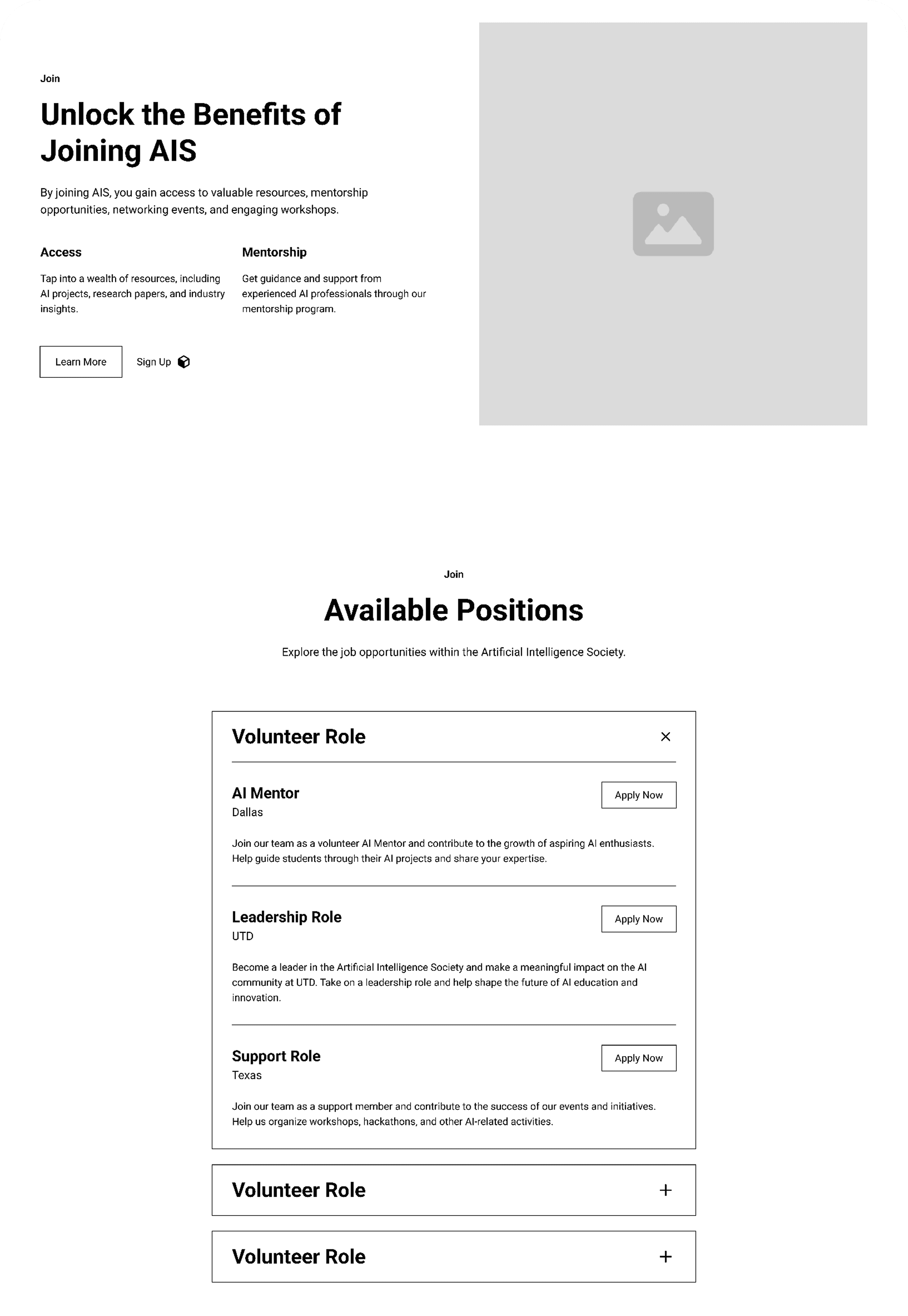
Join Path Optimization

Strategic redesign leads with value proposition and social proof before presenting membership applications—converting interest into commitment.

BEFORE

BEFORE

BEFORE

after: home page

after: home page

after: home page

AFTER

AFTER

AFTER

Key Improvements

Value proposition first — "Unlock the Benefits" hero section explains what users gain before asking for commitment

Visual storytelling — Colorful word cloud (EMPOWERMENT, CONNECTION, NETWORKING) makes benefits tangible and exciting

Reduced visual noise — Clean blue-bordered cards replace overwhelming purple/blue gradients

Social proof — Testimonial carousel builds trust and demonstrates real member experiences

Clearer pathways — Three-step join process (Submit → Engage → Receive) breaks down membership into digestible stages, reducing intimidation

📈

The redesign delivered significant improvements in user engagement and conversion metrics

Click-Through Rate

<20% → 40%

Page Impressions

2x Increase

Event Turnout

↑ Higher

reflection

reflection

reflection

Reflections & Learnings

This project taught me valuable lessons about balancing stakeholder needs, technical constraints, and user experience while maintaining design vision.

What Worked

User-centered approach kept decisions focused on solving real pain points

Collaborating with new tech team early prevented implementation blockers

Leveraging Relume AI accelerated wireframe exploration within timeline

Establishing visual brand identity transformed perception of AIS

📚

What I Learned

Balancing minimal brand guidelines with creative freedom requires strategic decisions

Value proposition before conversion ask significantly improves engagement

Technical constraints drive innovation—limitations sparked creative solutions

Iterating from wireframe to final design based on feedback improves outcomes

Next Steps

Conduct usability testing with target users to validate design decisions

A/B test different CTA placements and messaging for conversion optimization

Develop comprehensive design system for consistent future updates

Track analytics to quantify long-term impact on membership and event attendance

Open to Chat!

Got feedback, ideas, or just want to connect?
I’m always up for a good conversation —

Let’s talk

Open to Chat!

Got feedback, ideas, or just want to connect?
I’m always up for a good conversation —

Let’s talk

Open to Chat!

Got feedback, ideas, or just want to connect?
I’m always up for a good conversation —

Let’s talk