
Project Brief
A mobile app that turns bucket list dreams into reality through social accountability and gamified progress tracking.
timeline
24 hours (WeHack 2023)
ROLE
UI/UX Designer
TEAM
1 Designer + 3 Developers
tools
Figma
Overview
People dream of adventures but struggle to act on them due to decision paralysis, lack of accountability, and difficulty coordinating with friends. Escapade combines curated discovery, friend challenges, and gamification to transform bucket lists from passive notes into interactive, community-powered journeys.
Impact at a Glance
🏆
1st Place Winner WeHack 2023: General Design Challenge
Leaderboard

Challenge

My List

Feed

Discovery

Design Process
We followed the Double Diamond framework to structure our 24-hour sprint:

DISCOVER
Research & Discovery
Secondary Research
Understanding the Problem
We began by exploring why people often dream of adventure but rarely pursue it. Secondary research revealed common patterns:
91%
Have Bucket Lists
Most Americans have created bucket lists, but many struggle to act on them without external motivation.
Stanford Medicine, 2016
35%
Declining Social Engagement
Since the pandemic, Americans say socializing and going out have become less important, showing a decline in spontaneous social engagement.
Pew Research, 2020
41%
Top Bucket List Priority
Getting healthier or losing weight is the #1 bucket list item, showing people prioritize self-improvement goals but often need accountability to achieve them.
YouGov, 2021
24-Hour Hackathon
Research Constraints
With limited time, we conducted structured internal team discussions (n=4) to quickly validate these patterns. While not a substitute for extensive user research, these discussions confirmed our hypothesis: people need both inspiration AND accountability to turn bucket list dreams into reality.
With more time, we would:
Conduct external user interviews (n=8-10) and usability testing
Survey 100+ users to quantify pain points statistically
Meet Emily: Our Primary Persona
We created Emily to represent our core user: ambitious professionals who crave adventure but struggle with decision paralysis and lack of follow-through. Emily became our north star throughout the design process—every decision was filtered through her needs.

competitive Analysis
What's Missing from Current Solutions

Research Synthesis
Key Insights
Our research pointed to one core behavior gap: people do not lack ideas for things they want to try, but they often lack the motivation, accountability, and clear next step to act on them. This shaped our MVP around three behaviors: discovering activities quickly, challenging friends for accountability, and tracking progress to maintain momentum.
DEFINE
Solution Strategy
To turn insight into action, we focused the MVP around three core behaviors:
2
Friend Challenges
Create lightweight accountability through simple accept/decline interactions.
develop
Ideation & Design
With only 24 hours, we moved quickly from insights to sketches, exploring multiple approaches to balance feature richness with execution feasibility.
⏱️ Design Constraints
24-hour timeline meant rapid iteration with limited user testing. We prioritized core features that directly addressed our research insights while staying technically feasible for our 3-person dev team.
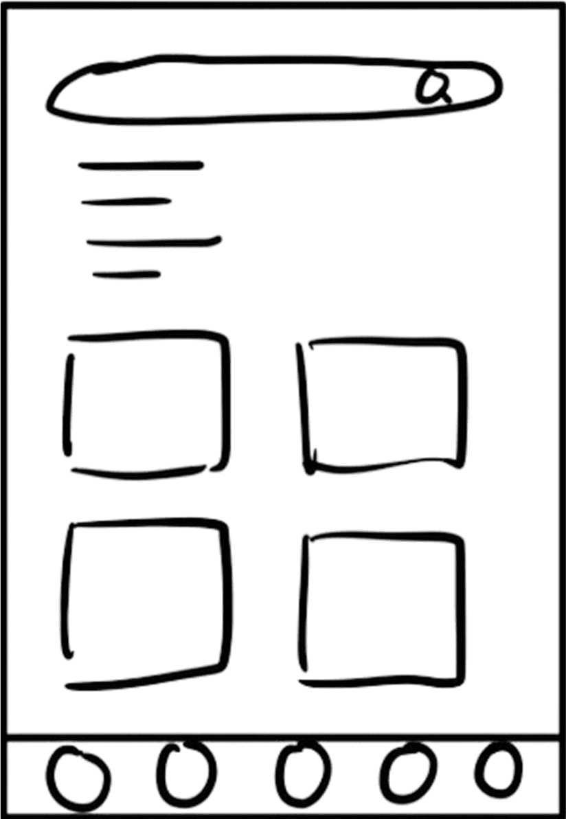
Discovery Screen Exploration

List-Based Discovery
✗ too overwhelming
Variation A
Card-Based Browse
✗ more visual, but still unstructured
Variation B

Search + Category Tiles
✓ selected because it supported both purposeful search and casual browsing
✓ Selected
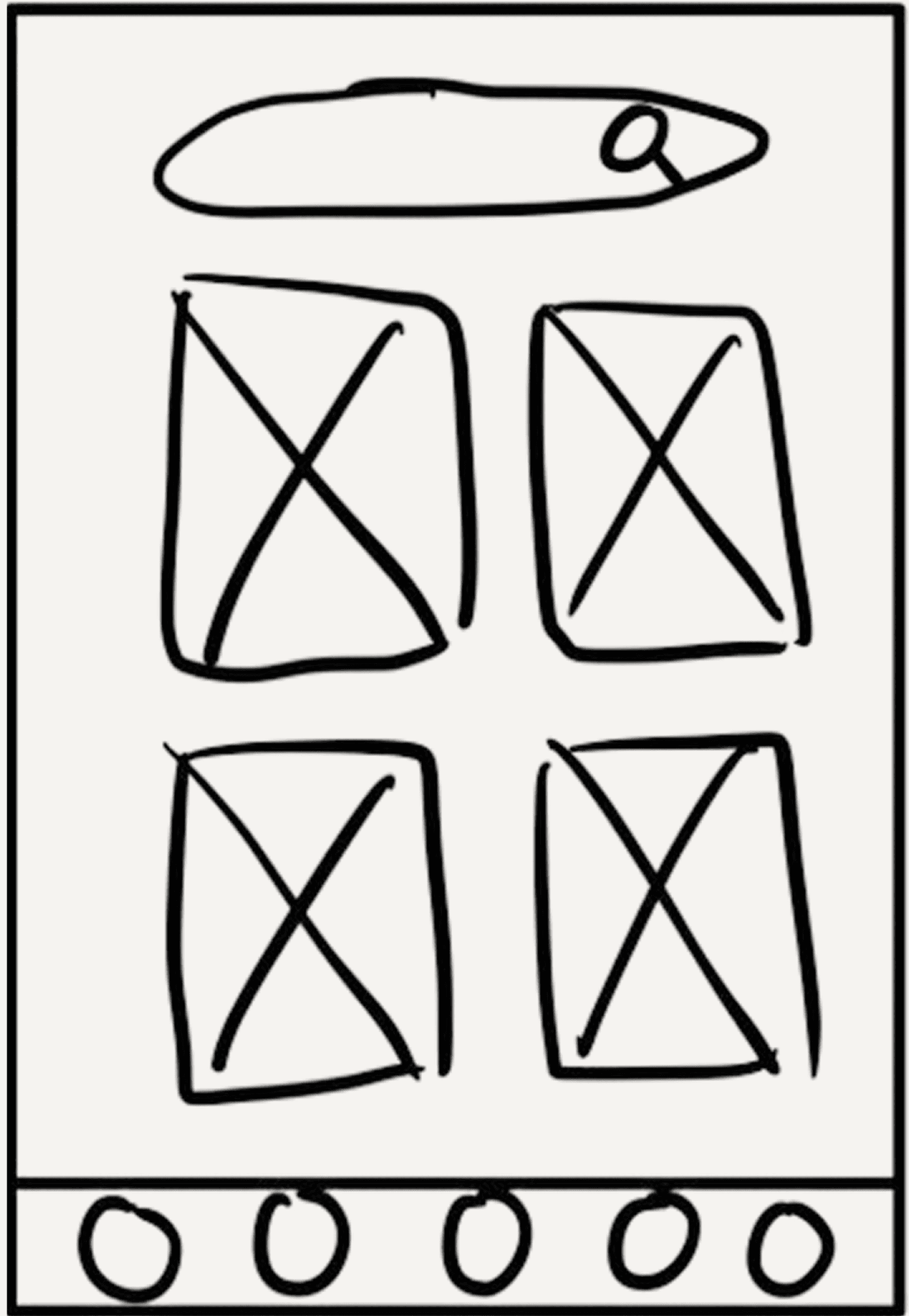
Challenge Screen Exploration

All Challenges at Once
✗ created too much decision pressure
Variation A
Conversational Format
✗ felt too formal and high-pressure
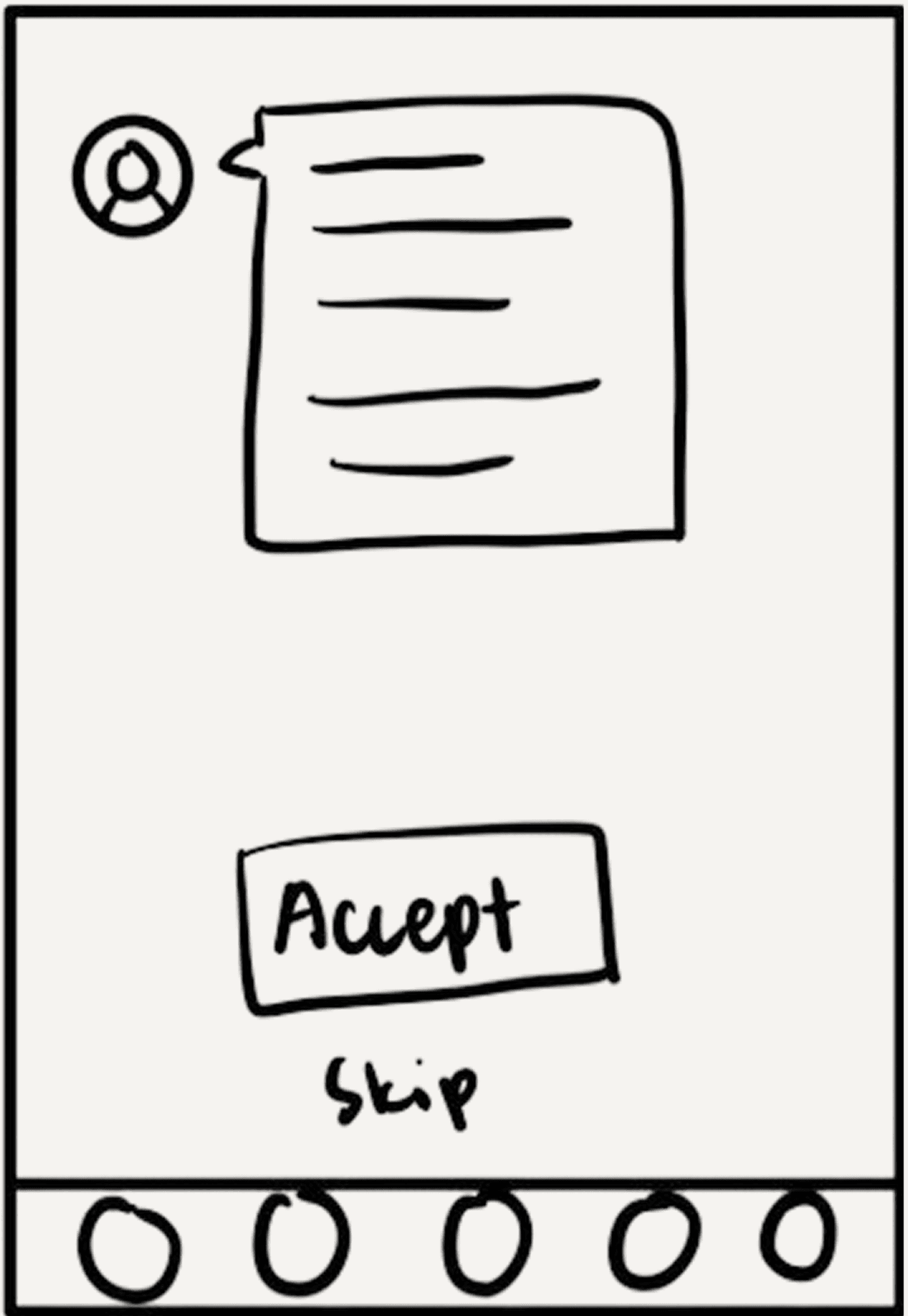
Variation B

Swipe Single Card
✓ selected because it made each commitment feel lightweight, focused, and easy to respond to
✓ Selected
Complete User Flow
After locking in the discovery pattern, I designed the remaining screens to create a cohesive journey from exploration to achievement.
1
2

3

4

5
deliver
Final Designs
With wireframes validated by the team, I moved into high-fidelity design, focusing on three core features that directly addressed our research insights.
Feature 1
Curated Discovery
Category tiles and search work together to reduce decision paralysis. Emily can browse by theme when exploring or search directly when she knows what she wants.

Search Bar
Quick access for goal-driven discovery when users know what they want
Category Tiles
Visual themes organize adventures into manageable, browsable options
Featured Adventures
Curated suggestions spark inspiration without overwhelming choice
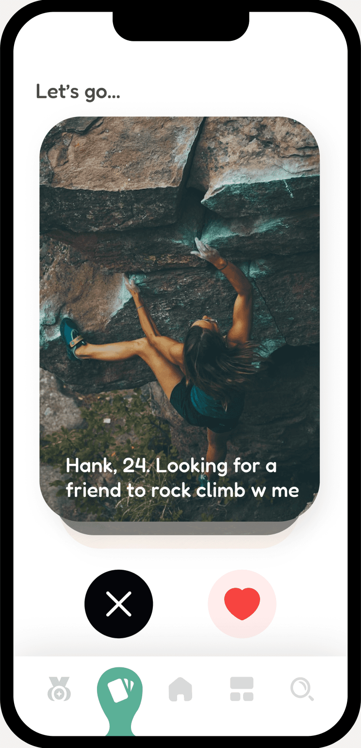
Feature 2
Social Challenges
The swipe-based challenge system was our breakthrough. It makes commitments feel casual and judgment-free—transforming social pressure into positive accountability.
Swipe left to decline, swipe right to accept, or tap buttons for explicit choice
Feature 3
Progress & Motivation
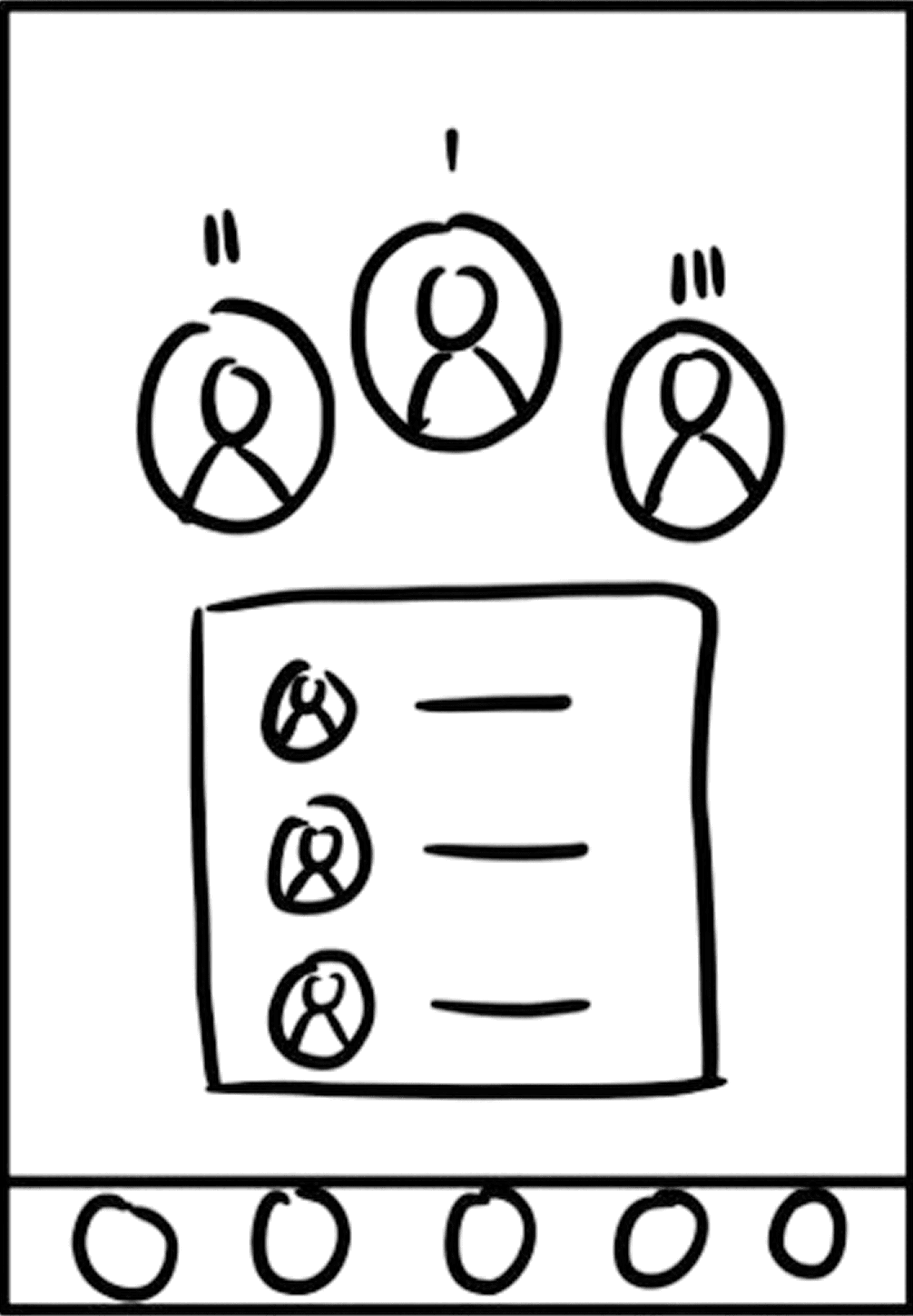
Gamification elements sustain engagement. Users track their bucket list progress and see how they compare to friends through leaderboards—creating healthy competition.
My Adventures
Personal dashboard shows in-progress and completed adventures with visual progress tracking
Leaderboard
Friend rankings and achievement streaks foster friendly competition and motivation
Complete Experience Flow


🏆
Escapade won 1st Place in the WeHack General Design Challenge, standing out among 59 teams for its UI/UX, product concept, and storytelling.
reflection
Reflections & Learnings
Designing Escapade in 24 hours taught me how to make intentional trade-offs. Instead of building a complex trip-planning system, we focused on the highest-impact flow: discover an activity, challenge a friend, and track progress. To help developers move quickly, I kept the design system lean, reused components, and prioritized the custom swipe interaction as the core experience. With more time, I would validate whether swiping feels meaningful enough for a real commitment, or if users treat it too casually. I would also explore how to balance social accountability with user control, ensuring Escapade motivates action without creating unhealthy pressure or comparison.